// Product Manager × AI Builder

Building things that
matter with AI

I'm Tim — a product manager based in Tokyo who designs and ships AI-powered experiences. From gamified learning apps to interactive storytelling, I turn ideas into products people actually enjoy using.

Who I Am

I'm a product manager with a passion for AI and a hands-on approach to building. Based in Tokyo, I bridge the worlds of technology and user experience — turning complex AI capabilities into products that feel intuitive and delightful.

My background spans IT product management, and I bring a unique perspective as someone who works across English, Chinese, and Japanese. I believe the best AI products aren't just technically impressive — they solve real human problems in surprisingly elegant ways.

Every project in this portfolio was built end-to-end: from concept and design through to a working, shippable product — with AI as a core collaborator in the process.

4
AI Projects Shipped
3
Languages Spoken
JP
Based in Tokyo
PM
Product Manager
← Back to all projects

Lunar New Year Challenge
新春大作戰

▶ Play the Game ⟨/⟩ View on GitHub

Overview

Lunar New Year Challenge (新春大作戰) is a three-stage mobile web game that transforms traditional Chinese New Year cultural elements — red envelopes, lottery tickets, and firecrackers — into playable game mechanics. The entire game runs as a single HTML file in any mobile browser, requiring zero installation. The goal was simple: build something fun enough to share with family and friends during the holiday season, while celebrating the cultural traditions that make Lunar New Year special.

Lunar New Year Challenge — Start Screen showing the horse character and Stage 1 instructions

Why I Built This

I wanted to explore whether a complete, polished mobile game could be built entirely through human-AI collaboration — with me providing the creative direction and gameplay feedback, and Claude handling all the technical implementation. Lunar New Year felt like the perfect theme: it's culturally rich, visually vibrant, and inherently social. Instead of just another greeting card app, I wanted to create something people would actually play.

The Three Stages

Each stage introduces a completely different gameplay type, keeping players engaged through variety rather than repetition.

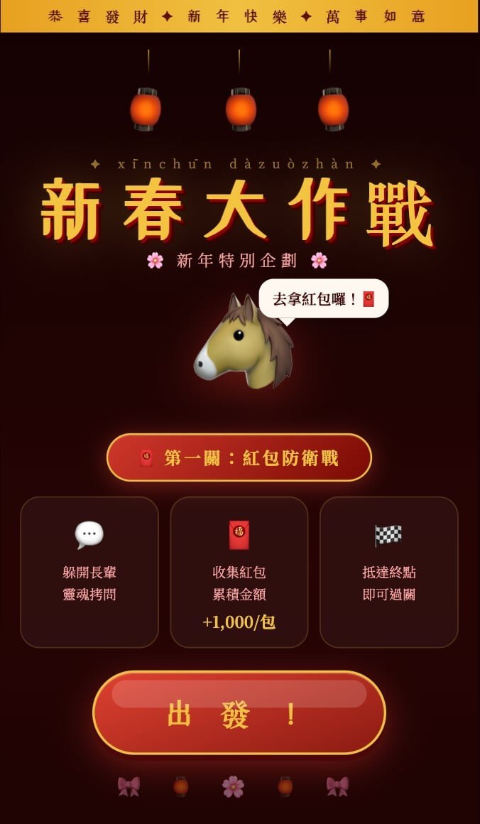
Stage 1 — Red Envelope Defense: Players control a horse character (a nod to the Chinese zodiac) and catch red envelopes falling from the sky while dodging obstacles. It's a classic action format built around an HP system, collision detection, and touch controls — designed to feel snappy and satisfying on a phone screen.

Stage 2 — New Year Lottery: A memory-based challenge where players must remember and collect the correct number combinations. This one plays on the "scratch card" atmosphere of the holiday season, testing short-term memory instead of reflexes.

Stage 3 — Firecracker Frenzy: A survival mode where players dodge waves of firecrackers with varying trajectories and blast patterns. The longer you survive, the more intense it gets — multiple explosion types keep the visuals fresh even in extended sessions.

Between stages, animated transition screens and firework particle effects give the game a complete, polished feel — not just three mini-games stitched together, but a cohesive experience from start to finish.

How AI Was Used

This project was built entirely through conversation with Claude. The collaboration model worked like this: I described what I wanted a stage to feel like, Claude produced a fully functional implementation, I playtested it on my phone, and then I fed back specific observations — "the red envelopes fall too fast," "the win button is too easy to miss-tap," "the explosions feel repetitive after 30 seconds." Claude would then adjust parameters, restructure UI elements, or add visual variety based on that feedback.

What made this work wasn't just code generation — it was the iterative loop. Claude built the entire Canvas game engine from scratch, including the game loop, state machine, collision system, particle effects, and multi-layer canvas rendering. But the quality of the game came from dozens of test-and-refine cycles where I translated subjective gameplay feel into concrete change requests.

Key Design Decisions

Memory games need real memory pressure. The first version of Stage 2 displayed the target numbers on screen the entire time — which completely defeated the purpose. Removing the persistent hint was an obvious fix in hindsight, but it reinforced an important principle: the core tension of a memory game is "can you remember it?" Anything that undermines that tension undermines the entire mechanic.

Primary actions must look primary. After clearing a stage, the "Next Stage" and "Retry" buttons were originally the same size and prominence. During playtesting, I kept accidentally hitting "Retry" right after winning — turning a moment of triumph into frustration. The fix was straightforward: make "Next Stage" visually dominant and demote "Retry" to a secondary style. It's a basic UX principle, but one you only truly internalize when you feel the pain yourself.

Difficulty curves can't be designed on paper. Both Stage 1 and Stage 3 involve objects spawning continuously. Too fast and the player is overwhelmed instantly; too slow and it's boring. Finding the sweet spot — "consistently tense but never hopeless" — required playing the game over and over and nudging spawn rates by small increments. No amount of theoretical planning could have replaced that hands-on tuning.

Visual repetition kills spectacle. Stage 3's explosions initially used a single animation pattern. It looked impressive for the first few seconds, then became wallpaper. Adding multiple explosion styles and particle variations solved this — the same mechanic felt dramatically more engaging simply because each detonation looked slightly different.

Tech Stack

The game is a single HTML file using HTML5 Canvas for rendering, vanilla JavaScript for game logic and state management, CSS3 animations for UI transitions, the Touch Events API for mobile controls, multi-canvas layering for visual depth (firework effects rendered on separate layers), and a custom particle system for all explosion and celebration effects. No frameworks, no build tools, no dependencies — just one file you can open in a browser and play.

Reflections

The biggest takeaway from this project isn't technical — it's about the collaboration model. Building a game through conversation with an AI inverts the traditional workflow. Instead of writing code and then testing, I was playing and then describing. The hardest part was articulating "game feel" — an inherently fuzzy concept — precisely enough for Claude to translate it into parameter changes. Saying "it feels too hard" isn't useful. Saying "enemies spawn every 0.8 seconds and I can't physically move my thumb fast enough to dodge them all" is.

The cultural elements weren't just a skin. Red envelopes, lottery, and firecrackers each naturally map to a different game genre (action, puzzle, survival), which meant the theme actually drove gameplay variety rather than just decorating it. That was a happy discovery — the best design decisions often come from constraints rather than from open-ended brainstorming.

If I were to do it again, I'd add a scoring system that persists across all three stages and some form of social sharing — a screenshot or short animation players could send to friends. The game was built to be shared, and making that sharing frictionless would have completed the loop.

← Back to all projects

Japanese Knowledge King
日文知識王

📱 App Store ⟨/⟩ View on GitHub

Nihongo Quiz King is a 1v1 quiz game for learning Japanese vocabulary, built with Expo/React Native and shipped to the App Store. This is an ongoing project — each article below documents a phase of its evolution.

← Back to version list

From Zero to the App Store

Overview

Nihongo Quiz King (日文知識王) is a mobile quiz game where you go head-to-head against an AI opponent, answering Japanese vocabulary questions under time pressure. It started as a personal learning tool — I was studying for the JLPT N4 and wanted something more engaging than flashcards — and ended up becoming my first app published on the App Store. Version 1.0 shipped as a Chinese-only app; version 1.1 added full English localization to reach a wider audience.

Why I Built This

Most Japanese learning apps follow the same pattern: see a word, flip a card, repeat. It works, but it's lonely and low-stakes. I wanted the tension of competition — someone else answering at the same time, a countdown ticking, the pressure of knowing that hesitation costs points. A 1v1 format turns vocabulary review from a chore into a game you actually want to win.

Beyond the product itself, I had a second goal: learn the entire iOS publishing pipeline from scratch. I'm not an iOS developer by background. I wanted to see whether AI-assisted development could take a non-native mobile developer from an empty folder to a live App Store listing — and how painful that journey would actually be.

Core Gameplay

Each match is a rapid-fire series of questions drawn from a pool of 200 JLPT N4 vocabulary words. You see a Japanese word in kana (hiragana/katakana only — no kanji displayed, which matters for Chinese speakers since kanji would essentially give away the answer), and pick the correct meaning from four options within 10 seconds. An AI opponent answers simultaneously, with its accuracy calibrated to your skill level so matches stay competitive.

Speed matters: faster correct answers earn more points. After each question, you see a head-to-head comparison — did you both get it right? Who was faster? At the end of the match, a results screen shows the final score with win/loss animations and sound effects. Your stats persist across sessions: level, cumulative score, and win rate are all tracked locally.

How AI Was Used

Claude was involved in virtually every layer of this project. The collaboration went well beyond "generate some code" — it covered the full stack of shipping a product.

Architecture and code: Claude set up the Expo project structure with expo-router, built all the core game logic (scoring engine, AI opponent behavior, question selection, AsyncStorage persistence), and implemented every screen — home, matchmaking, battle, and results. The animated ring timer (SVG-based countdown) and option button animations (bounce on correct, shake on wrong) were all Claude's work.

Content creation: The entire 200-word N4 question bank was produced through collaboration with Claude — Chinese meanings, English meanings, category tags, and carefully crafted distractor options in both languages. Getting distractors right is harder than it sounds: they need to be plausible enough to challenge the player but not so similar that the question feels unfair.

Asset generation: App icons and splash screens were generated via Python Pillow scripts that Claude wrote. Sound effects (six distinct audio cues for correct, wrong, timeout, victory, defeat, and match start) were also generated programmatically through Python scripts.

Publishing support: Claude helped navigate the entire App Store Connect workflow — writing app descriptions and keywords in both Chinese and English, generating properly sized screenshots, configuring EAS Build settings, and debugging submission issues.

Key Technical Decisions

Expo + EAS over native Xcode. As a non-iOS developer, going fully native would have been a massive detour. Expo with EAS Build let me compile in the cloud without touching Xcode for most of the process. The trade-off is less control over native modules, but for a game that runs entirely in React Native views, it was the right call.

AI opponent instead of real-time multiplayer. Real PvP would require a backend server, matchmaking logic, and infrastructure costs. An AI opponent that adjusts its accuracy based on the player's level gives the same competitive feeling at zero server cost. It's a solo app that feels like a multiplayer one.

Kana-only display, no kanji. This was a game design decision disguised as a UI choice. Japanese kanji and Chinese characters overlap heavily — if the question showed 食べる, any Chinese speaker would immediately know it relates to eating. Showing only たべる forces genuine recall. It's a small detail, but it's the difference between a real quiz and a giveaway.

Auto-detect language, no manual toggle. Version 1.1 added English localization using expo-localization. Rather than adding a language picker to the UI, the app simply follows the device language. One fewer setting to think about, one fewer screen to build, and users get the right language automatically.

The Worst Part: One Week in Review Limbo

Version 1.0 was rejected by App Store review. The reason turned out to be absurdly simple: the name field in app.json didn't exactly match the app name configured in App Store Connect's primary language settings. That's it. A string mismatch.

But finding that answer took a full week. App Store review feedback can be vague, and as a first-time submitter, I didn't have the pattern recognition to quickly narrow down the cause. I cycled through dozens of hypotheses — wrong bundle ID? Missing privacy declarations? Screenshot issues? — before landing on the actual problem.

The fix took 30 seconds. The debugging took seven days. That week cost more calendar time than the entire development phase before it. The lesson is now permanently burned into my process: every time you submit a build, verify that app.json name matches App Store Connect exactly.

Other Painful Lessons

react-native-svg dependency hell. A version conflict between React 19.1 and 19.2 broke the SVG package. The fix required --legacy-peer-deps during local install and adding legacy-peer-deps=true to .npmrc so EAS Build's cloud environment would also cooperate. This kind of issue — works locally, breaks in CI — is uniquely frustrating.

Reanimated v4's naming trap. Version 4 of react-native-reanimated requires a package called react-native-worklets. Version 3 used react-native-worklets-core. Almost the same name, completely different package. Installing the wrong one silently breaks all animations with no useful error message. Hours lost to a hyphen.

App Store Connect's hidden UI. The app name isn't set on the version page — it's under "App Information," a separate section. Adding a new language for localization is buried in a dropdown labeled "Not Yet Localized" on the version page. Every language needs its own screenshots, description, and release notes filled in separately. None of this is obvious to a first-time user.

What Shipped

Version 1.0 launched as a Chinese-only app with the full 200-word question bank, AI opponent, scoring, sound effects, and persistent stats. Version 1.1 added complete English localization — UI strings, question bank (meanings, categories, and distractors all translated), and bilingual App Store metadata. The app is live on the App Store and the source code is open on GitHub.

Reflections

This project proved something I'd suspected but hadn't tested: a non-iOS developer can go from zero to a live App Store product using AI-assisted development, and the result doesn't have to feel like a prototype. The game is genuinely playable, the animations feel polished, and the publishing is real.

The most expensive mistakes weren't technical. They were process mistakes — not understanding App Store conventions, not knowing where settings live in App Store Connect, not anticipating dependency conflicts in cloud build environments. These are the things that no amount of code generation can prevent. You learn them by shipping, failing, and shipping again.

The cross-conversation memory file (MEMORY.md) that Claude and I maintained turned out to be critical. Without it, every new conversation would start from scratch — re-explaining the project structure, the tech stack, the decisions already made. With it, Claude could pick up exactly where we left off. For any multi-session AI project, this is the single highest-leverage practice I'd recommend.

← Back to all projects

Gamified Job Search
求職遊戲化

✏️ Article draft pending — Tim will provide project details for this write-up.
Topics to cover: motivation, features, AI integration, challenges, results.

Overview

[To be written — brief summary of what the project is and why it was built.]

The Problem

[To be written — what gap or opportunity did this project address?]

Solution & Key Features

[To be written — how AI was used, what the user experience looks like.]

Technical Highlights

[To be written — architecture, tools, and interesting technical decisions.]

Results & Reflections

[To be written — outcomes, lessons learned, what you'd do differently.]

← Back to all projects

Memories of Flight
飛行的回憶

▶ Play in Browser ⟨/⟩ View on GitHub

Overview

Memories of Flight (飛行的回憶) is not a game you play to win. It's a game you play to feel something. Built as a single HTML file using Canvas and vanilla JavaScript, it's a narrative experience about loss, regret, and the slow work of reconciliation — told not through cutscenes, but through the act of dodging and catching words as they fall from the sky.

The premise is simple: you control a glowing soul drifting upward through six chapters. White text fragments are memories to catch. Red text fragments are pain to avoid. But the mechanics carry a deeper logic — and the way the screen responds to damage tells you more about the story than any dialogue could.

Why I Built This

Traditional storytelling media — novels, films — let you observe emotion. Interactive media can let you inhabit it. I wanted to test a specific hypothesis: that game mechanics themselves can function as metaphor. When your thumb is physically trembling to dodge a red phrase that reads "it's all your fault," you're not just processing information. You're experiencing a micro-simulation of emotional impact.

The goal wasn't to make something fun. It was to make something that lingers — that players remember not because of a high score, but because of what they felt in the gap between catching a beautiful memory and being immediately punished for it.

Mechanics as Metaphor

The core interaction — catch white words, dodge red words — sounds like any other arcade game. What makes it different is that every design decision maps to an emotional idea.

Collision detection is deliberately uneven. White text (memories) has a generous hit zone. Red text (pain) has a tight one. This isn't a balance problem — it's the point. In life, warmth is hard to hold onto; hurt finds you easily. The asymmetric collision radii encode that feeling directly into the controls.

Catching a memory triggers a danger spike. After you successfully grab a white fragment, the red text spawn rate jumps from 50% to 95%. Every beautiful recollection is immediately followed by a wave of pain. This is the emotional core of the game: remembering something good doesn't bring comfort — it brings everything that came after.

Your soul glows brighter when it remembers. Each white text collected expands the player character's glow radius and quickens its pulse. It's a tiny visual reward — a moment of warmth before the red flood hits.

Two Kinds of Pain

The game's two main chapters use identical core mechanics but completely different damage aesthetics. This was a deliberate design decision rooted in a simple insight: not all pain looks the same.

Chapter 1 — "One Month Ago": The palette is blue-purple. When red text hits you, the screen flashes red and shakes violently. The words shatter into individual character fragments that rain down like debris. This is acute trauma — sharp, loud, impossible to ignore.

Chapter 2 — "Three Months Ago": The palette goes darker, colder. When red text hits, the screen doesn't shake — it slowly loses color, fading toward grayscale. Long sentences crack in half mid-flight and plummet at accelerated speed. This is a different kind of pain: the quiet erosion of a relationship. Words that break off before they finish. The feeling of something draining away rather than exploding.

The technical implementation behind each is distinct: Chapter 1 uses CSS-style screen flash and particle burst effects; Chapter 2 uses getImageData pixel manipulation to progressively desaturate the entire canvas. Same engine, completely different emotional register.

Narrative Structure

The game is organized through a state machine: HOME → STORY → CHAPTER_TITLE → GAMEPLAY → RECAP, cycling through six chapters across two timelines. Between gameplay segments, chapter recaps display three illustrated scenes with typewriter-style text that fades in line by line. At the end of each recap, the scene shatters into particles before transitioning to the next chapter — a visual metaphor for memories fragmenting.

The text content — both the white fragments you catch ("that Friday afternoon," "the text message you sent," "a small shoe rolling across the floor") and the red phrases you dodge ("you only ever loved your work," "I regret everything") — was all written to carry narrative weight. They're not random vocabulary. They're pieces of a story the player assembles through play.

How AI Was Used

Claude's role in this project went beyond code generation into something closer to creative collaboration. When I described abstract emotional goals — "I want the pain in Chapter 2 to feel muffled, not loud" — Claude translated that into a concrete technical proposal: replace the screen shake with progressive desaturation. When I said "the sentence should feel like it was cut short, like someone who stopped talking mid-thought," Claude implemented a text-splitting mechanic triggered at 20% of screen height, with the broken halves accelerating at 2.5x speed.

The codebase still carries traces of our debugging conversations: console logs tagged with emoji (🎯 生成紅字..., 💥 碰撞!..., 📊 統計...) that we used to trace why certain red texts weren't shattering correctly, or why the sentence-split timing was off in Chapter 2. These aren't cleaned up — they're artifacts of a working process.

Claude also handled the deployment pipeline: setting up the GitHub repository, configuring jsdelivr CDN for image assets (https://cdn.jsdelivr.net/gh/{user}/{repo}@main/{path} with crossOrigin = 'anonymous'), and walking through GitHub Pages setup.

Key Design Decisions

Canvas over DOM. Particle systems, real-time pixel manipulation (the grayscale filter), radial glow effects, and screen shake all perform far better on Canvas than with DOM elements. The trade-off is losing built-in accessibility — every UI element had to be drawn manually. For a game that's fundamentally about visual and kinesthetic experience, Canvas was the right medium.

Subtraction as a design principle. Mid-development, the UI had accumulated score displays, timers, hint text, and health indicators. I deliberately removed most of them, keeping only a minimal health bar and a memory score. The reasoning: any element that reminds the player "this is a game" breaks the emotional immersion. In an era where AI can generate infinite content, knowing when to stop adding is the harder skill.

Player size reduction. The player avatar shrank from 50px to 35px during iteration. Smaller meant more precise dodging, which meant each near-miss felt more personal. When you barely escape a red phrase by a few pixels, the relief is visceral in a way a 50px hitbox can't deliver.

Split point at 20%, not 50%. Chapter 2's sentence-breaking mechanic initially triggered at the midpoint of the screen. But at that height, fast-falling text often passed the trigger without being detected. Moving it to 20% gave the split more screen time — players could actually see the sentence crack apart and accelerate — and gave them more (but not enough) reaction time.

Technical Challenges

Sentence split timing. The hardest bug to fix. Text was flying past the split trigger point between frame checks, so sentences that should have broken in half just fell through intact. The solution involved tightening the detection window and adding safety logs to confirm splits were firing. A timing problem disguised as a rendering problem.

Cross-origin image loading. Local image paths broke on GitHub Pages. The fix required hosting images via jsdelivr's GitHub CDN and adding crossOrigin = 'anonymous' to every image load — without it, Canvas getImageData (used for the grayscale effect) throws a security error because the canvas becomes "tainted."

Cross-device scaling. A single scale factor (Math.min(W / 375, H / 667)) applied to all game elements — player size, text size, spawn positions, collision radii — kept the experience consistent across phones and desktops. Both mouse and touch inputs are supported, with touch-action: none preventing accidental zoom on mobile.

What Shipped

A complete, playable narrative game in a single 996-line HTML file. Six chapters across two timelines, each with three illustrated recap scenes. A full visual effects system: particle bursts, screen shake, progressive grayscale, radial glow, static noise, tunnel vision. Cross-device support via dynamic scaling and dual input handling. Deployed on GitHub Pages with CDN-hosted assets. A modular architecture where adding new chapters means extending arrays, not rewriting systems.

Reflections

This project confirmed something I'd believed but hadn't proven: game mechanics can carry emotional weight without a single line of traditional dialogue. When the screen slowly loses color in Chapter 2, players don't need a narrator to explain what's happening — they feel it. The mechanic is the message.

The collaboration model with Claude worked especially well for this kind of project, where the gap between creative intent and technical implementation is wide. I could say "the pain should feel like it's being swallowed, not screamed" and get back a concrete implementation using pixel-level desaturation instead of screen flash. That translation layer — from emotion to code — is where AI collaboration adds the most value in creative work.

If I were to build on this, I'd add an ambient soundtrack that shifts with the chapter mood, and explore whether the finale could use the accumulated memories (the white texts the player caught) to generate a personalized ending. The architecture supports it. The emotional logic demands it.